Delta vs. United
Tags: Airline Website, Usability Evaluation, Cognitive Walkthrough
Time: 2013
Team Members: Michael Lefco
Role: Task Analysis
A cognitive walkthrough evaluation to compare the usability of two major airline websites.
Cognitive Walkthrough has been used as a method to identify usability issues. With evaluators walking through a task(or tasks) with the empathy of thinking themselves as typical users, usability issues are identified by answering a set of specific usability-related questions while completing the task. To identify usability issues of airline websites as well as to understand different website design approaches that have been used to meet users' need, a comparison evaluation of two airline websites is conducted and illustrated as below. A task of finding the phone number of “lost baggage” office is used as a sample task in the cognitive walkthourgh. Several usability issues have been found and the difference between the design of two websites is discussed.
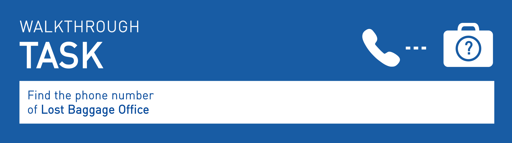
The cognitive walkthrough sample task is to find the phone number of lost baggage office on Delta.com and United.com. A task analysis were done prior to the walkthrough to identify steps required to successfully find the phone number. Then, evaluators acted as they were first-time users of both websites and went through the steps of the sample task to find out if there were any usability issues regarding completing the task. At each step, evaluators created scenarios of users using the website by answering the following four questions:
Q1: Will the user try to achieve right effect?
Q2: Will the user notice that the correct action available?
Q3: Will the user associate the correct action with the effect they are trying to achieve?
Q4: If the correct action is performed, will the user see that progress is being made toward solution of their task?
As walking through each step, evaluators noted every identified usability issue. After the task walkthrough, a thorough analysis of the design of both websites was performed.
Overall, it took less effort (in terms of both time and steps) to find the phone number of lost baggage office on United.com than it did on Delta.com when users know exactly what were the steps. It seemed very simple to find the phone number of the lost baggage office on United.com that it only took two steps. However, it was difficult for users to figure out how to perform the right steps due to the lack of feedback after user input and the distraction caused by the messy layout. Though there were more steps needed to find the phone number on Delta.com, performing each step was relatively easy with the website being able to provide evident feedback. In addition to that, Delta.com provided more flexibility for users to find the phone number that they were able to find the phone number in more than one way.
United.com arranges all the information in a hierarchical way that users are able to retrieve a certain piece of information in only one way. Users can only get to the page with the phone number of the lost baggage office by following the steps described above. Whereas Delta.com offers more flexibility to users that there are several ways to retrieve a certain piece of information because the information is arranged like a net that there are lots of nodes for users to access. The navigation aid/help is available all the time in different forms on Delta.com. Users can use the top navigation bar as well as some navigation menu that are generated based on users’ input. Other than that, there is a pop-up window on the homepage to guide users how to achieve their goals specifically. It may benefit users with diverse background in terms of familiarity with technologies that it allows users to choose a way they are most familiar with to find the information they need. For example, if the users are not familiar with the internet, there is a pop-up window with plain worded instruction and icons on the right bottom corner to help users. (Figure 1) United.com offers the similar help function by having an avatar on the top right corner of the homepage which can be overlooked by some users because of the location and size. (Figure 2)
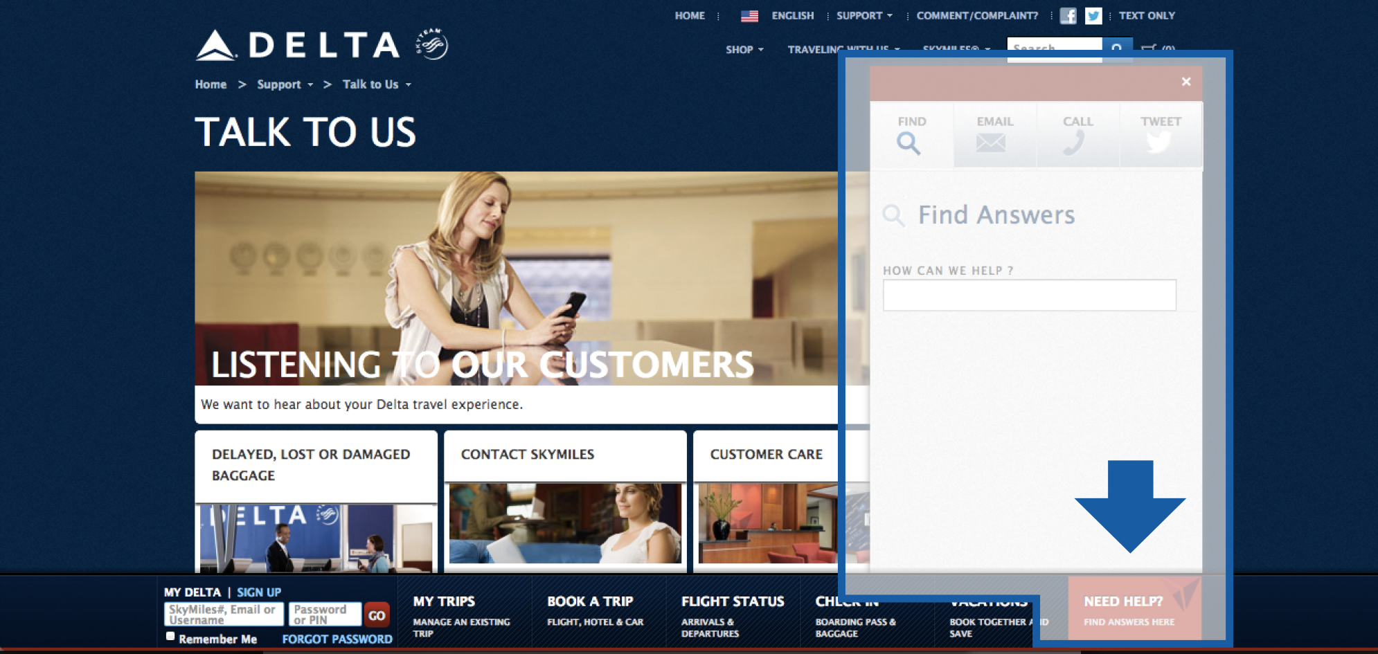 Figure 1. Help Option on Delta.com
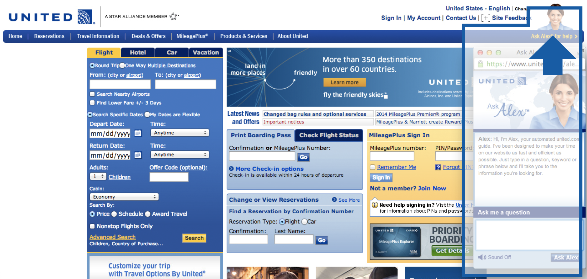 Figure 2. Help Option on United.com
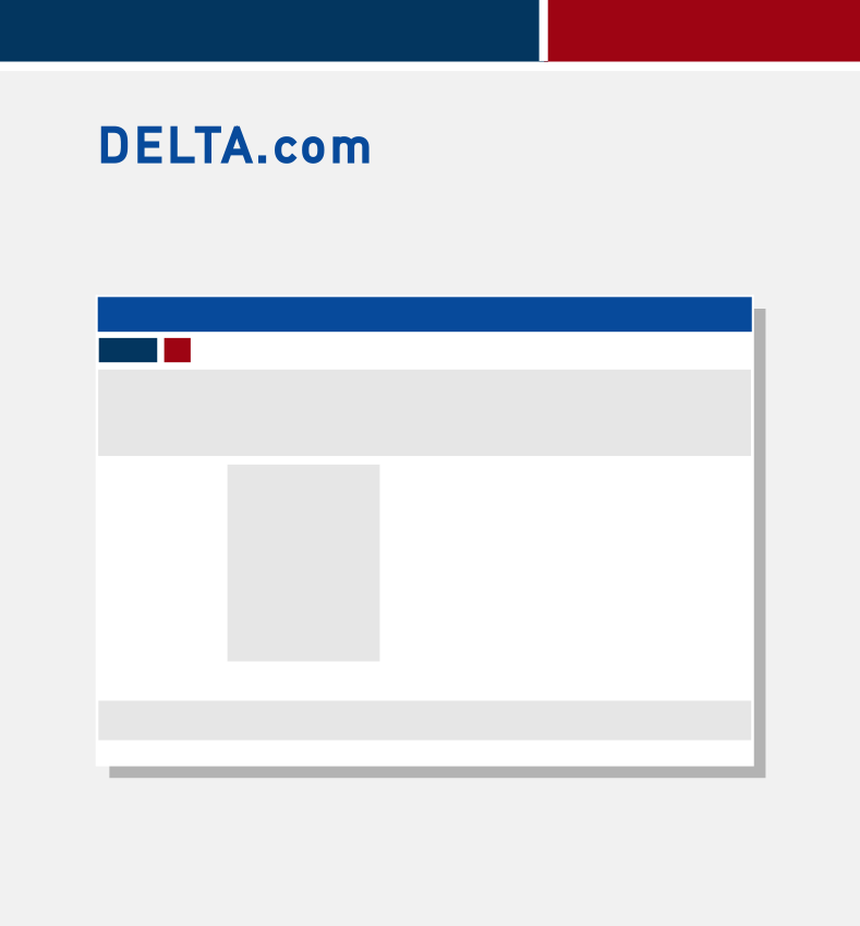
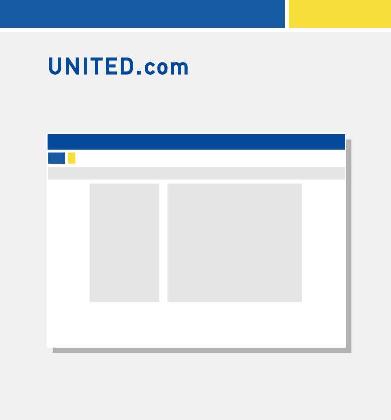
There is huge difference between the visual layouts of the two sites. The layout of each page on Delta.com is clean and with less information on it (Figure 3). The layout of the pages on United.com is relatively busy and with lots of information on it (Figure 4). Since there are lots of information on one page, when users are trying to find a certain piece of information, the rest of the information become distracting. It will be harder for users to find the “contact us” link on United.com compare to finding it on Delta.com because there are more irrelevant information to distract users.
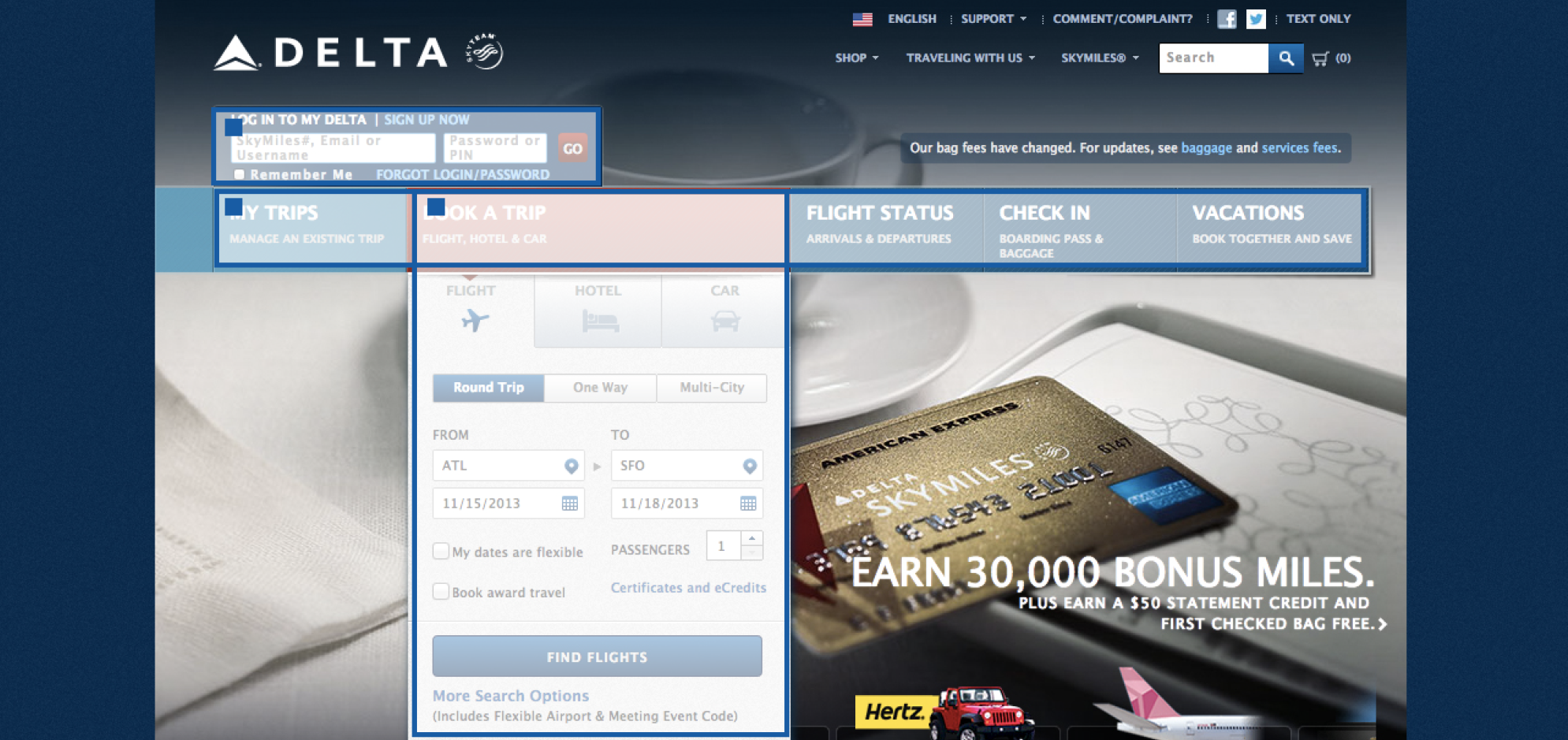 Figure 3. Homepage on Delta.com
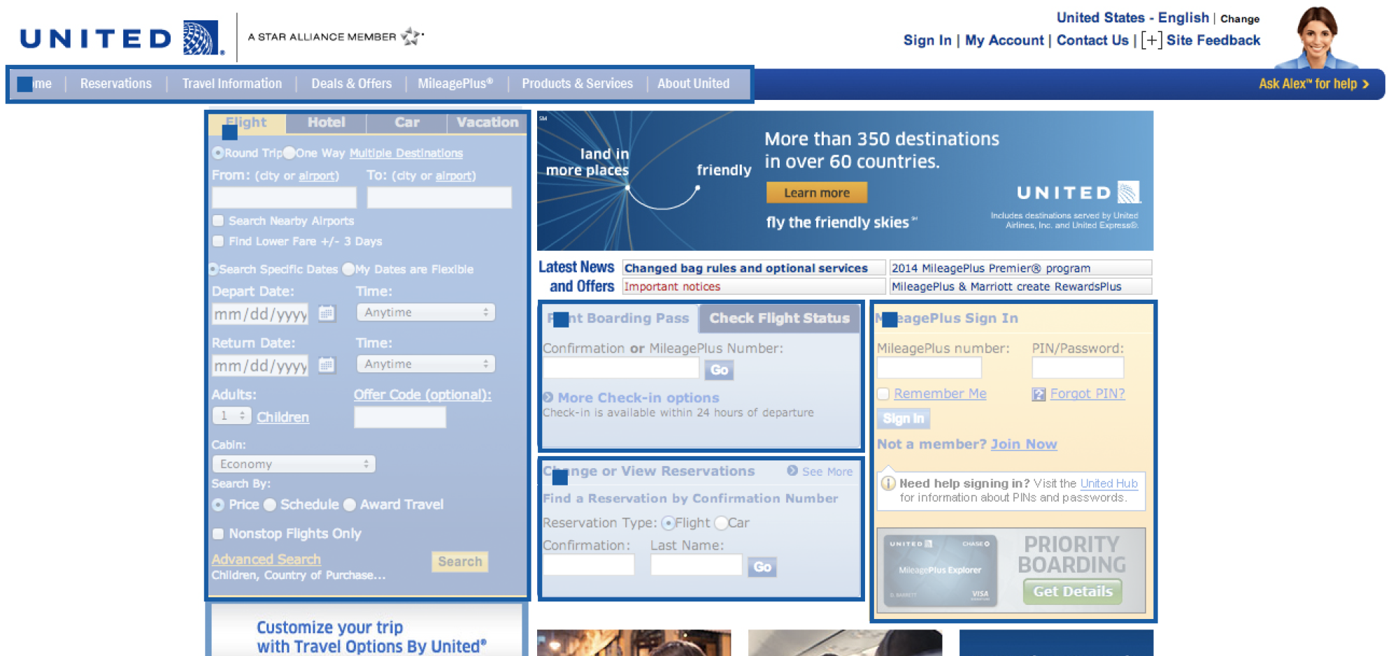 Figure 4. Homepage on United.com
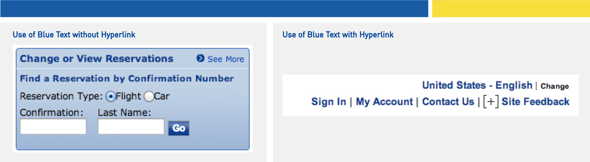
Besides that, the text size on Delta.com is generally bigger than it is on United.com, especially for showing some important functions users may need such as booking tickets and check-in. The text on United.com is small and crowded which make it hard to see. The text with hyperlink is not well decorated that there is no difference between the text with a hyperlink and the text without a hyperlink. This could be confusing to users since they can not tell whether the text will lead them to more information they need unless they hover it to get adequate feedback. In addition to that, the drop-down menus on the homepage are in low contrast with the white text on a grey background. It may create some barriers to people with visual impairments and older adults.
Both sites have offered the visual feedback for users’ input to some extent. Users will have better experience with using Delta.com because Delta.com offers more feedback by having the hover effect. The effect is obvious that it allows users to notice the possible options. It will change the color of the active area when users mouse-over them, which makes the target more evident as well. United.com offers relatively less feedback that it will only change the shape of the cursor from a pointer to a “hand” when users mouse-over the active area. Such a small change as feedback may not be noticeable for people with impaired vision. Capturing the hovering action and then offering enough feedback to let users better predict what will happen next will help users know about the possible options. Knowing the possible options they have will then help them to find what they really need.

As discussed above, United.com will be more efficient for the users who are familiar with using the internet and knowing where to find the information because it only takes two steps to get the phone number. Both of the sites are effective in terms of allowing users to find the phone number of the lost baggage office. While Delta.com may be more effective for a more diverse population because it offers several ways and enough feedback when users are trying to complete the tasks.